

A Small Business Website Redesign: Case Study
How redesigning a website (not completely rebuilding it) improved search rankings, usability, and the customer experience.

Modernizing a vintage home and redesigning an older website have a lot in common. In both cases, the goal is to preserve what still works -- while updating the features, appearance, and functionality to meet today's expectations.
 11 min read •
 Share this article
Families remodel a home when it no longer fits their needs, when the curb appeal starts to fade, or when it's simply time to bring things up to code. Sometimes all it takes is a fresh coat of paint. Other times it's a gut renovation. Either way, the bones of the house -- the things that made it worth keeping -- stay put.
The same is true of websites.
A site might start out strong -- driving calls, building a customer base, ranking well in search but the web keeps moving. A site that stands still will eventually get left behind. Pages start to load a little slower. Rankings slip. Competitors who were never a threat suddenly show up above you in Google.
That's exactly what happened to a long-established Nebraska ranch website we'd originally built nearly 20 years ago. And the redesign that followed is the subject of this case study.
The redesign was a project with our longtime partners at the Heartland Healing Center in Omaha. Working together, we focused on creating a website that better serves today's customers while honoring the ranch's long-established identity and values.
The Original Site:
Perfect for Its Time
When the original Pawnee Pride Meats website was launched, it was perfect for its time: attractive, information-rich, and well-suited to how people used the internet in the early 2000s. For years, it ranked near the top of page one and consistently drove new sales.
As web standards and reader expectations evolved, however, some of their historical keyword rankings began to soften.
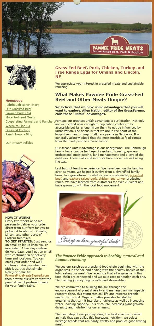
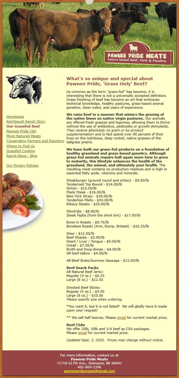
The original site served the business well for many years -- clean, informative, and clearly built with care. But it reflects the design standards of the early 2000s rather than today's.
The content was still excellent. The ranch's story was compelling. What had changed was what new customers now expect from websites:
- Nearly two-thirds of online traffic now comes via phones -- and the original fixed-width layout required pinching and zooming just to read a paragraph.
- Browsers began flagging non-HTTPS sites as "Not Secure" -- a trust-killing warning for any food business asking customers to place orders.
- Search engines had grown far more sophisticated about how the content is structured, whether it is mobile friendly, and how quickly pages load. Many of these factors are discussed in our articles on SEO, mobile-friendly design, and website performance.
- Customer expectations had shifted: people now expect to scan quickly, find what they need in seconds, and feel confident before taking action.
None of these changes was the original site's fault. It was simply built for an earlier era.
Pre-Redesign Considerations
Before writing a line of new code, we established two ground rules.
Not All Improvements are of Equal Importance
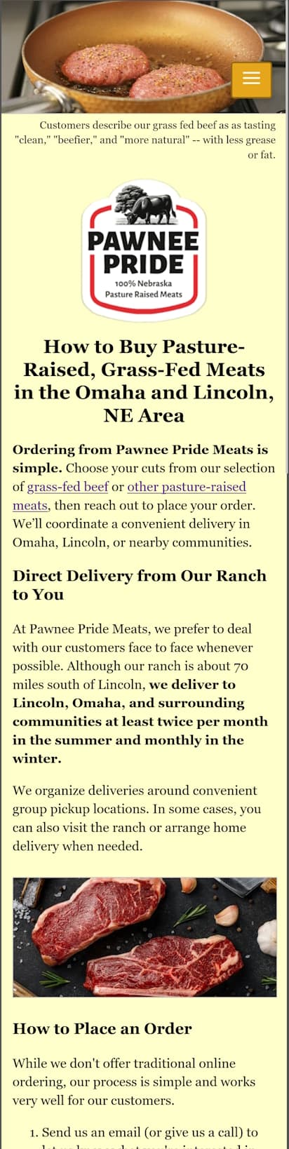
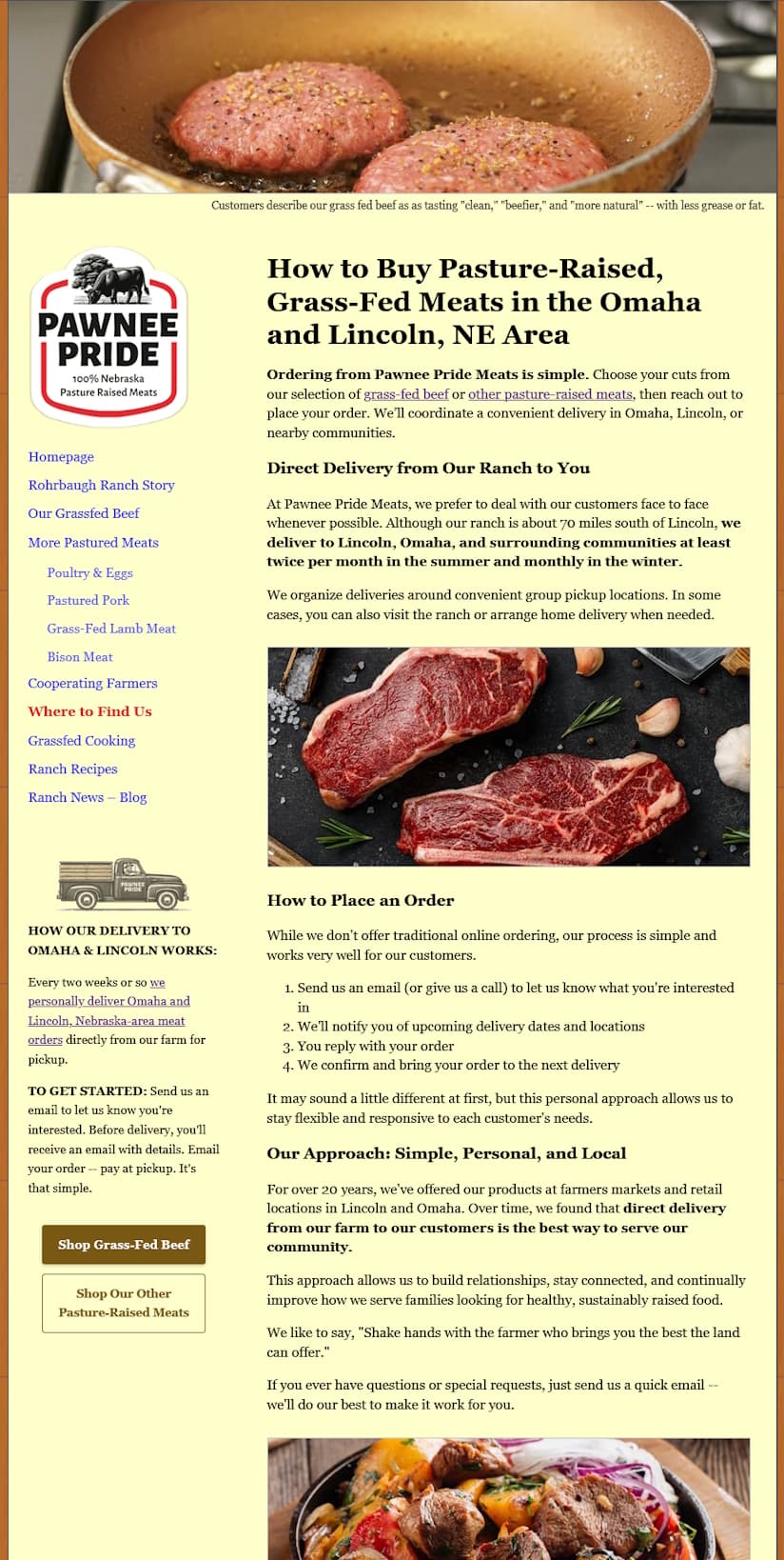
Our initial audit uncovered dozens of opportunities for improving the visitors' experience, search engine rankings, and sales. But a few upgrades were absolutely critical.
Since 60-65% of all visitors are arriving on phones, the redesign had to be mobile friendly -- equally easy to navigate, read, and order from regardless of the device: phone, tablet, or desktop.
Navigation:
One Click to Almost Anything
The original navigation was a simple list: one link per section, no sub-navigation, no quick paths to specific products. Getting from the home page to, say, grass-fed lamb required at least two clicks and some hunting.
We expanded the menu to add sub-links for each meat category -- beef, pork, poultry, lamb, bison -- visible directly in the nav. On desktop, the full navigation sits in the left column alongside the delivery information. On mobile, it collapses into a clean hamburger-style menu.
The result: visitors on any device can reach almost any page in a single tap or click.
Home Page:
Designed to Build Trust Immediately
Top
Testimonials & FAQ
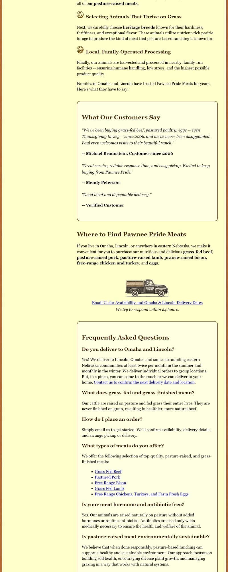
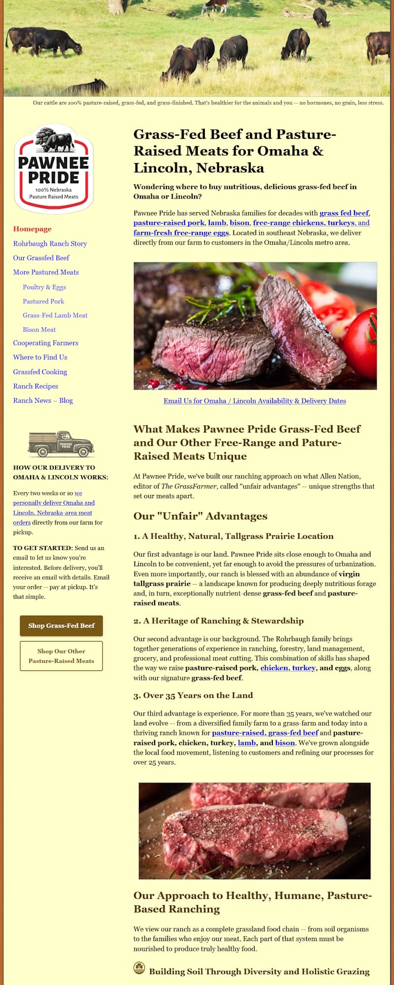
The redesigned home page breaks the original single text column into scannable sections, adds customer testimonials, an FAQ, and places clear calls-to-action throughout. All of this, while preserving the visual identity customers already trusted.
The original home page was essentially one long column of paragraphs. Excellent content, but easy to bounce from -- especially on a phone. The redesign restructured it around how people actually read websites today: they scan, rather than read.
Enhancements to Existing Content
The "unfair advantages" narrative -- location, heritage, 35+ years on the land -- was reorganized under clear subheadings. The three pillars now read as a structured story, not a wall of text.
Testimonials, Given a Spotlight
Customer reviews were previously buried in a navigation link. They now appear prominently on the home page, where they do their real job: giving first-time visitors a reason to trust the ranch before they've read a single product description.
"We've been buying grass-fed beef, pastured poultry, eggs -- even Thanksgiving turkey -- since 2006, and we've never been disappointed. Paul even welcomes visits to their beautiful ranch.
-- Michael Braunstein, Customer since 2006A Frequently Asked Questions Section
Common questions about how the delivery model works, what "grass-finished" actually means, and how to place an order are now answered before the visitor has to ask -- reducing the back-and-forth emails that come from uncertain first-timers.
Calls to Action, Throughout
The original site assumed visitors would find their way. The redesign guides them into taking an action: "Email Us for Availability," "Shop Grass-Fed Beef," "View Our Beef Cuts & Prices" -- clear, friendly nudges at every natural stopping point.
Product Pages:
From a Price List to a Shopping Experience
Top
FAQ
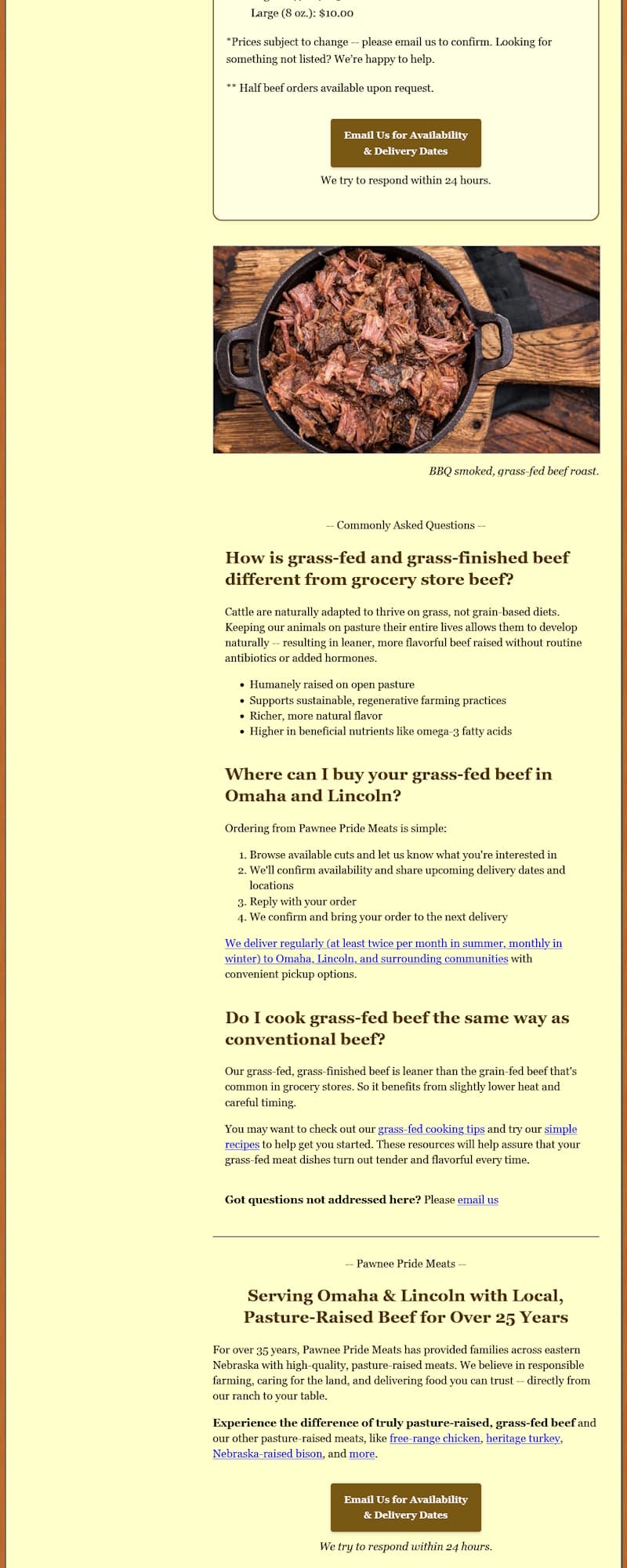
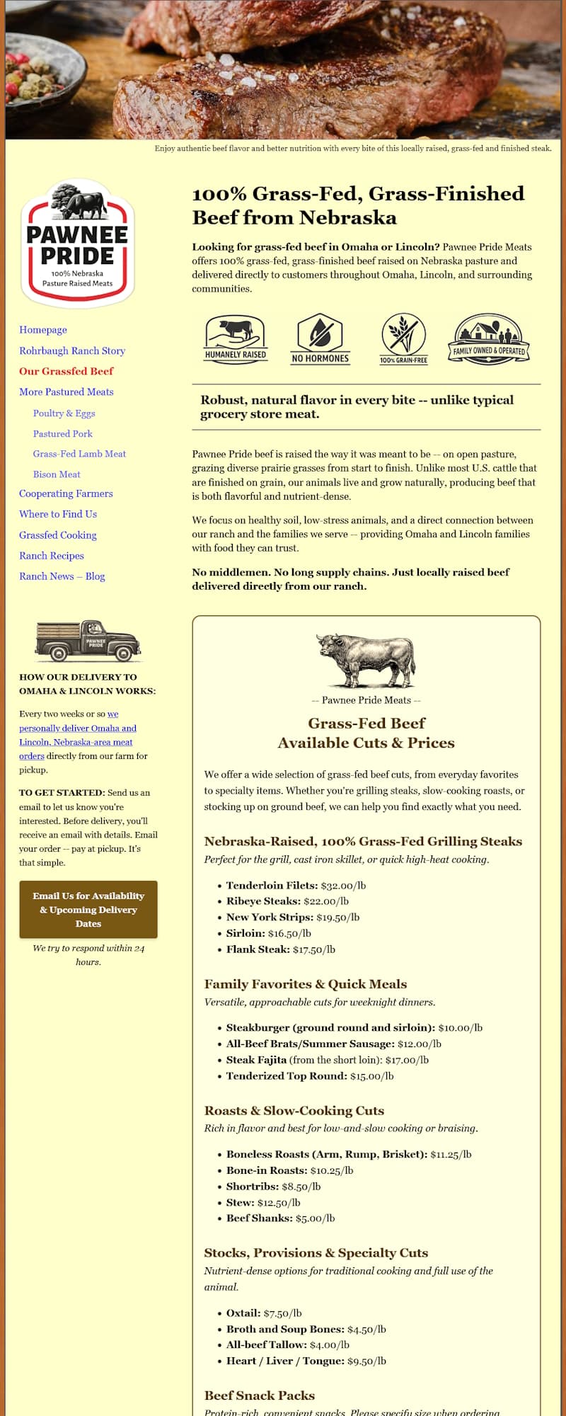
The original product page listed all cuts in a single list format. The redesigned version organizes them into intuitive categories -- each with a brief, appetite-inviting description -- and adds trust badges, an FAQ, and clear ordering CTAs.
The original beef product page had two things: a paragraph about what makes the beef special, and a plain-text list of cuts with prices. Perfectly functional for early web buyers -- but modern shoppers look for a more intuitive, visual experience.
The cuts are now organized into clearly labeled categories -- Grilling Steaks, Family Favorites & Quick Meals, Roasts & Slow-Cooking Cuts, Specialty Cuts, Snack Packs -- each with a short intro line. This makes scanning faster for the returning customer, and introduces the adventurous shopper to cuts they might not have considered.
Trust Badges, Up Front
Immediately below the opening paragraph, four badges communicate the ranch's core commitments at a glance -- before the visitor reads a word of body copy.
- HUMANELY RAISED
- NO GROWTH HORMONES
- GRAIN-FREE DIET
- FAMILY OWNED & OPERATED
An FAQ Section
Questions about ordering, how grass-fed beef differs from store-bought, and where to find cooking help are all answered on the page -- with embedded links to the "cooking tips" and "recipes" pages. These catch the attention of curious customers and send them deeper into the site.
Supporting Pages:
Reduce Buyer Hesitation and Help Assure Satisfaction After the Sale
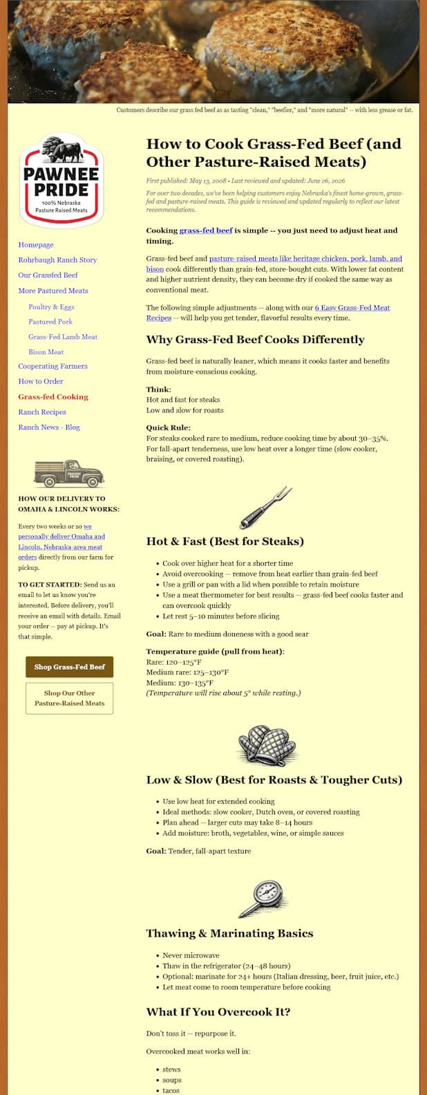
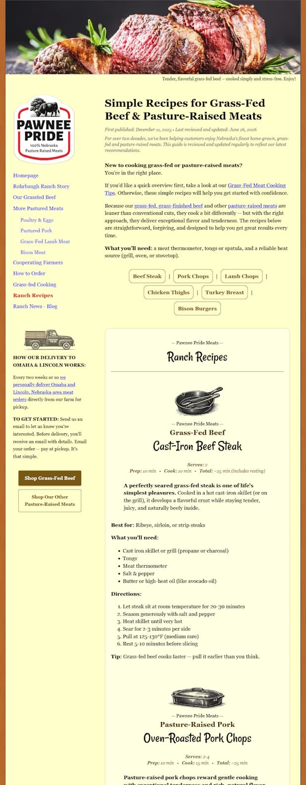
The original cooking tips page was a single dense paragraph. The redesign breaks this into fast-cooking vs. slow-cooking sections, thawing and pull temperatures, and even tells you what to do if you overcook -- so no meal goes to waste.
The entirely new Ranch Recipes page features six simple, beginner-friendly recipes -- one for each protein Pawnee Pride offers -- with step-by-step instructions and a warm visual style.
Disappointed customers rarely come back. (Worse yet, they might leave a negative review.) And, in the case of premium food products, the most common source of disappointment isn't the product -- it's the preparation.
To ensure every customer gets the perfect meal, we collaborated with the ranch to turn their expertise into two dedicated pages:
1. Cooking Tips:
From One Paragraph to a Practical Guide
The original "Cooking Tips" page was a solid wall of text. Good information, but overwhelming on a phone. The redesign breaks it into targeted sections: Hot & Fast for steaks, Low & Slow for roasts, Thawing & Marinating Basics, and -- a personal favorite -- What If You Overcook It? (Don't toss it. Repurpose it into tacos, soup, or a braise.)
The page now includes exact pull-from-heat temperatures -- the kind of specific, practical guidance that turns an anxious first-timer into a confident regular.
2. Ranch Recipes:
A New Page, From Scratch
Six recipes, one for each protein the ranch sells. Each includes an equipment list, step-by-step directions, and a one-line tip:
This page reduces buyer hesitation before the first order and helps ensure a satisfying outcome after the sale. It might also help the site rank for recipe-based searches -- potentially reaching local, first-time visitors.
Contact Page:
Contact Details + So Much More
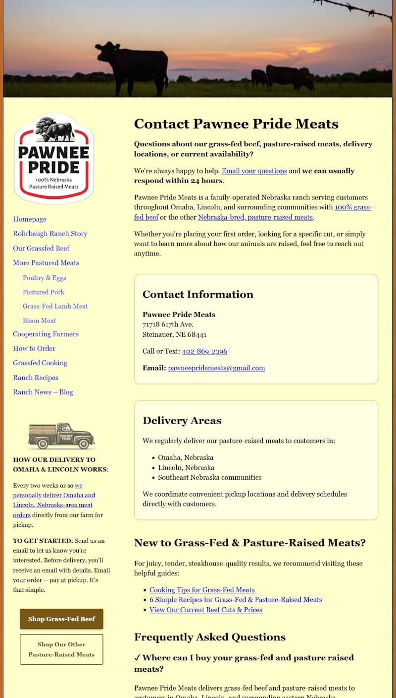
The original site had no dedicated contact page -- since the contact information already appears in the footer of every page. But a contact page can be much more than just a phone number, address, and email. It's a valuable opportunity to share other important information.
A contact page is consistently one of the most visited pages on any website -- and visitors expect to find one. This one works as a content hub. It provides:
- A clean contact card with a tappable phone number and obfuscated email
- A delivery areas section (Omaha, Lincoln, Southeast Nebraska)
- A "New to Grass-Fed?" section linking to cooking tips and recipes
- An expanded FAQ, including a detailed grass-fed vs. grocery-store comparison
- A warm closing note from the Rohrbaugh family, signed with their actual signature
Much like fine wine, grass-finished beef carries the flavor of the specific pastures where the cattle grazed.
-- from the Pawnee Pride Contact page FAQPre-Launch Quality Checks
Before going live, the redesigned site went through a quality-control checklist:
- Quillbot grammar check -- caught a handful of small errors that spellcheck missed.
- W3C Broken Link Checker -- assured that all internal links had been updated as some page urls had been added and changed. (Remember to check previous page redirects as well.)
- W3C Markup Validator -- confirmed clean, error-free HTML -- important since we build hand-coded rather than platform-generated pages.
- Schema Markup Validator -- verifies that the structured data markup was correctly formatted. This helps search engines understand exactly what each page is about.
- Google PageSpeed Insights -- the final health check before launch.
Audit of Redesigned Home Page

Near-perfect PageSpeed Insights scores confirmed the redesign was technically sound before going live. (We recommend every site owner run this free audit on their current site -- the results can be eye-opening.)
Finishing Touches:
SSL and CDN
Two of the most important improvements in the entire project happened in the final hour -- and neither one is visible to visitors.
SSL certificate. Before the redesign, the site ran on HTTP. This caused some browsers to flag the site as "Not Secure." We installed an SSL certificate (which encrypts the connection between the website and visitors).
CDN (Content Delivery Network). Cloudflare's CDN now distributes the site's files worldwide. This enables the pages to load faster, regardless of where the visitor is. It also protects against malicious traffic.
The Outcome:
A Dominant Presence on the First Page of Google's Search Results
Page 1
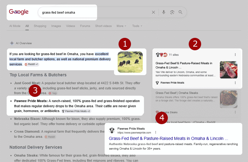
Within a month of launch, Pawnee Pride Meats climbed from the lower half of page one to positions 2-3 for key search terms. Perhaps more importantly, the site now appears multiple times before the traditional search listings even begin.
One search. Four opportunities for the client's site to be discovered:
- AI's Overview's Featured Image: Google chose a relevant image from the client's site to associate with their AI Overview. This increases brand recognition and trust.
- AI Overview Citation: This places the site among the most trusted sources that Google refers to when answering a searcher's questions.
- Top Local Farms & Butchers: This is a prime location for capturing the attention of high-intent searchers.
- Organic Search Results: Slightly lower in the page, Google's 'traditional' search listings begin. Being listed among the top 3 sites is important for consistent, long-term traffic and qualified leads.
Why all of this is important: The client's site now holds multiple positions on Google's first page -- AI, local, and organic. This multi-layered visibility drives more awareness, more trust, and more customers.
We thank the family at Pawnee Pride Meats for allowing us to be part of their online journey. Their dedication to raising high-quality grass-fed and pasture-raised meats made this redesign especially rewarding.
We also extend our sincere appreciation to Omaha's Heartland Healing Center for their longstanding partnership and for coordinating the project.
Final Thoughts
The reason many websites may begin to lag over time, or never really take off, isn't that they're doing anything horribly wrong. It's that competitors are quietly doing a better job across dozens of small details. And, as those SEO and usability gaps multiply -- performance declines.
In this case, the original Pawnee Pride site was genuinely good. It had strong content, a clear identity, and a loyal customer base. The redesign's job was simply to bring all of that to a wider audience, on every device, with the kind of clarity and confidence that turns visitors into buyers.
If you know another small business owner who could benefit from it, please
Is your website performing the way it should?
If your site isn't meeting your sales-generating or lead-building expectations, call us. We offer a free, free, no-obligation website evaluation with specific improvement recommendations.
Joe Web site design
Asheville, NC
Call 828-551-9761



 EMail:

