
Call-to-Action Best Practices for Conversions and User Experience

When you walk into a physical store, you may already have a good idea of what you're looking for. If a greeter is there to offer suggestions, answer questions, and point you in the right direction, however, that can eliminate possible frustrations or confusion. It makes the buying experience easier and more enjoyable.
The same idea applies for website visitors. They probably have an idea of what they're hoping to find, but many are still in the browsing phase. That's where CTAs come in. They guide visitors toward taking the next step--whether that's making a purchase, booking an appointment, downloading a free guide, or simply learning more.
May 14, 2025 • 8 min read
Your Call-to-Action May Determine Whether Visitors Proceed--or Leave
SEO brings visitors to your website. But once they've arrived, you still have to earn their trust and guide them toward becoming paying customers. CTAs can play an important role in that process -- helping highlight your expertise, build confidence, and move visitors one step closer to taking action.
Whether you're offering a free checklist or pitching a premium service, your CTA is a pivotal moment in the user journey. Below are the five factors that matter most when crafting CTAs that truly convert.
5 Considerations When Writing Great Calls-to-Action
1) WHY Are You Including Calls-to-Action on the Page?
Before designing or writing a CTA, ask yourself, what is the intent of this page, and what is the visitor ready to do?
Match your objective to the visitor's mindset:
✔ Browsing Stage: Offer low-commitment CTAs like "Download our free checklist" or "Read related articles."
Displaying a 'soft sell' CTA to this audience allows you to develop a relationship without scaring them off.
✔ Engagement Stage: Encourage actions such as "Sign-up for Our Newsletter" or "Share This Page With a Friend."
Requiring a minimal investment (such as an email address) allows you to actively build a list of prospects. It may also weed out visitors who don't have a serious interest.
✔ Conversion Stage: Prompt decisive actions like "Start your free trial" or "Buy now."
These will come across as natural and appropriate if the page or post focuses heavily on your products or services, or if it's more likely to be seen by repeat visitors or those in a buying frame of mind.

Got Your Hands Full?
If you don't have the time to create effective CTAs, call the design team at Joe Web in Asheville. We'll implement CTAs that get results! Call today: 828-551-9761
2) HOW should the CTA Look and Read?
Presentation matters as much as position. A poorly worded or visually bland CTA won't get clicks, even if it's promising a valuable resource or offer.
✔ Appearance: Inline vs. Display
Inline CTAs are subtle links inside the main body copy. While these are often faster for designers to create, and they're less of an interruption for readers, inline CTAs can be easily overlooked or ignored by visitors if they are not well styled. Consider these for less critical objectives, such as "download the checklist."
Display CTAs can take the form of stand-alone banners, buttons, callouts, or stand-alone sections. These are the better option for major actions like signing up or scheduling.
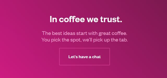
Example:

This collection of display calls-to-action from SmashingMagazine shows that CTAs don't have to be boring or pushy. When they're well-crafted and even delightful, users look forward to engaging with them.
See other examples of inline and display CTAs, at our Call to Action examples post.
✔ Wording That Converts
If you want your content to convert, your calls to action need to be clear, compelling, and customer-focused.
Here are five of the most common CTAs and how you can make them work harder:
- Instead of "Click Here," try "Get Your Free Guide Now."
This gives your reader a reason to click, plus includes a hint of urgency. - Swap out "Submit" for "Send Me the Tips!"
This adds energy and reminds users of the value they're about to receive. - Ditch "Buy Now" in favor of "Order Within the Next 9 Mins for Free, Same-Day Shipping."
Creating urgency encourages faster action. - Upgrade "Learn More" to "Let Us Show You How It Works."
It sounds like an adventure, not a chore. - Change "Sign Up" to "Receive Our Free Weekly Newsletter, Jam-Packed with CTA Tips."
It makes the action feel welcoming and worthwhile.
✔ Tips:
- Use verbs.
- Create urgency. ("Get it Now!")
- Highlight outcome, hint at intrigue. ("See what's holding your site back. And how to fix it.")
- Speak to the visitor's motivation, not yours.
3) WHERE Should CTAs Appear on the Page?
Positioning isn't just about visibility--it's about timing.
✔ At the Top of Page (Above the Fold)
Pro: High visibility
Pro: Quick and convenient for highly motivated shoppers
Pro: May work well when the reward or offer is irresistible or when urgency or social proof (star ratings, testimonials) are nearby.
Con: Can feel pushy, especially for new visitors.
Best Practices: Top of the page CTAs should be relevant to the page's primary content and provide immediate value or a clear next step.
Example:

This Branex home page offers multiple CTAs above the fold, all attractive, easy to access, and non-intrusive. The top header nav bar, the red 'Enquire Now' button (along the right side ), and the green telephone icon (whatsapp widget in the bottom left corner) are all sticky elements on the page. So they stay visible, even as visitors scroll.
✔ Within the Body Copy (Contextual CTAs)
Pro: Feels organic.
Pro: Works well when highly relevant to surrounding content (they offer a logical next step in the visitor's information-gathering process).
Con: May be less noticeable, depending on styling.
Best Practices: Use clear and action-oriented language, make them visually distinct (e.g., as buttons or highlighted links), and ensure they flow naturally with the surrounding text. These work especially well in blog posts, tutorials, or long-form content.
✔ End of Page
Pro: Catches the most engaged readers.
Pro: Perfect for higher-commitment asks.
Con: Many visitors won't scroll that far.
Best Practices: Ideal for strong follow-up offers after building trust with content.
✔ Sticky CTAs or Side Column
Pro: Always visible.
Pro: Provide a persistent opportunity for conversion without being overly intrusive.
Con: Consume visible space on page that could otherwise contain content.
Con: Can be distracting on mobile.
Best Practices: Should be visually noticeable but subtle. Ensure sticky any CTAs do not interfere with readability on different screen sizes. These work well for "Live Chat," "Request a Quote," or "Book Now" offers.
✔ Popups
Pro: High visibility and high conversion potential for newsletter signups or special offers.
Con: Can be annoying and result in higher bounce rates.
Con: May have SEO implications, especially on mobile (per Google's intrusive interstitial guidelines).
Best Practices: Use sparingly and make it easy to close. Trigger based on behavior--like exit intent or scroll depth. Save popups for high-value offers (gated tools, downloads, etc.).
Examples:

A less intrusive, more user-friendly popup from LitHub.
Since it consumes only the bottom 1/4th of the page, it's noticeable and accessible but still allows visitors to read the page's main content.
We spotted this less-invasive popup at thedeletedscenes.substack.com.
After reading past the first 5 or 6 paragraphs, the background begins to darken and this small interstitial scrolls into view. By then, the reader is hooked! Fortunately, the closure link is easy to spot.

FAQ: How Many CTAs Should Be on a Page?
There's no hard rule. But here are some practical guidelines:
- One Primary Goal: Keep a single main CTA per page that aligns with the page's core purpose.
- Landing Pages: Typically one focused CTA (e.g., sign up, download, purchase).
- Homepages: May include multiple CTAs for different visitor types--but each should be clearly distinct and purposeful.
- Blog Posts: Include CTAs relevant to content (e.g., download a guide, join a list) plus optional secondary CTAs for deeper engagement.
- Product/Service Pages: One core CTA ("Start Free Trial") and a soft alternative ("Learn More" or "Contact Us").
Examples:


Three homepage examples where the CTA is the first thing you see and is the primary focus. While most sites lead with the solutions or benefits they offer or product features, these above-the-fold, immediate, conversion-oriented calls-to-action seem to work well. Sources: Call Dad, Indochino, Heritage Collection
4) WHAT Happens After the Click? (Handling Requests)
The CTA doesn't end when someone clicks a button. That's where your opportunity really begins.
- Confirmation Pages: Route users through a lightweight thank-you page that:
- Thanks them
- Pre-loads the download or directs to next steps
- Offers additional content
- Provides tracking for conversions
- Include CTAs Inside the Downloaded Content: Don't let the PDF be a dead end. Embed small offers like "Need help implementing this? Book a free call."
- Email Follow-Up (If You Collected One): Deliver value first, then offer another step (e.g., "Want us to review your site for free?").
5) WHAT'S Working (and What's Not)?
CTAs may look simple, but dozens of small decisions determine whether visitors click or ignore them. Real-world A/B tests (like the many found on Growbo's landing page testing library) show that even "throwaway" choices -- a button color, one word in the headline, or whether the CTA appears above the fold -- can swing conversions by double digits.
Some of the most common CTA variables that can affect performance include:
- Tone & Message: Emotional appeals ("frustrated with low traffic?"), benefit-driven wording ("get more leads"), or action-focused commands ("start today").
- Offer Type: A demo, discount, consultation, checklist, or free guide can each appeal to different visitors.
- Wording: Tiny changes matter -- "Get Started" vs. "See Pricing" can produce different click behavior depending on user intent.
- Button vs. Text Link: Buttons typically outperform plain text, especially on mobile.
- Colors & Contrast: High-contrast buttons often earn more clicks than colors that blend with the page.
- Size & Shape: Rounded corners, wider buttons, and larger tap targets can improve mobile conversions.
- Placement: Above the fold, at the end of a section, sticky/floating, inline with text -- all can vary dramatically in performance.
- Whitespace: CTAs surrounded by space often stand out more (and convert better) than crowded designs.
- Supporting Copy: Microcopy like "no credit card needed" or "no sign-up required" can remove friction.
Example:
Great example of a low-friction (low-pressure, low-commitment) 'schedule a meeting' CTA from avenue.design
Example:
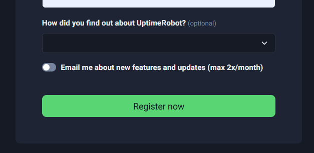
Excellent example of reducing 'newsletter sign-up' friction: instead of vaguely asking users to 'join our newsletter,' this form proactively addresses and neutralizes a common concern. By promising only occasional emails ('max 2x/month'), they lower hesitation and build trust, which can improve conversion rates.
- Visual Cues: Arrows, icons, or images of people looking toward the button can draw attention.
- Urgency or Scarcity: "Limited spots available" or "Only 2 left" can increase clicks -- when used honestly.
- Social Proof: Adding a testimonial or number of satisfied clients can reassure hesitant visitors.
The lesson? Unless you have real tracking in place, it's impossible to know which elements help or hurt performance. Visitor-behavior tools like Google Analytics and Search Console show exactly which CTAs get clicked, which get ignored, and where visitors drop off -- so you can refine your design based on actual data, not guesses.
Example of Call-to-Action that feels helpful and engaging rather than intrusive.
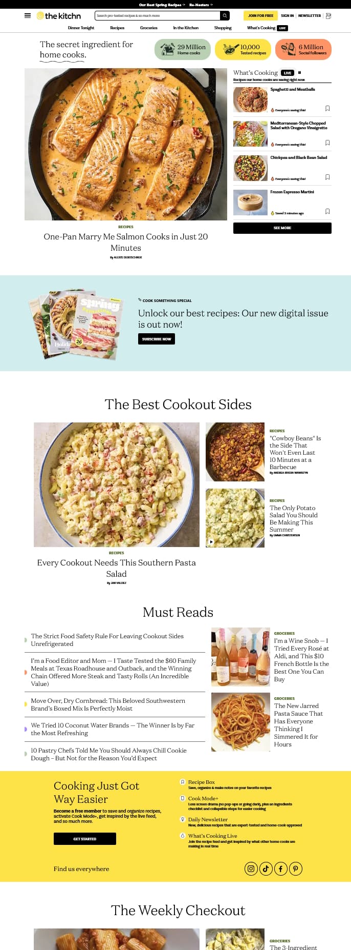
The Kitchn pairs strong trust-building elements with strategically designed and worded CTAs:
- The yellow "Join For Free" button near the top feels more welcoming and benefit-focused than the common "Sign Up For Our Newsletter."
- The green, yellow, and peach-colored trust badges ("29 Million Home Cooks," etc.) immediately build credibility and a connection with their readers.
- The retro-colored blue and yellow Calls-to-Action inside the page body don't feel like advertisements. They're designed more like editorial content sections -- visually appealing and naturally attention-grabbing.
Final Thoughts
Don't assume visitors know what to do next. Many are on the fence and need a nudge. That's the purpose of CTAs -- they guide visitors toward taking the next step and becoming customers.
The most effective calls to action are:
- Aligned with your visitor's mindset
- Placed where interest peaks
- Designed to be clear, focused, and engaging
- Supported by what comes after the click
Ready to Take Your Website to the Next Level?

