
450x450
800x800
Don't bet on visitors waiting around for a slow loading website.
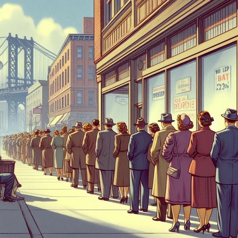
Above: Large Image: 800x800-optimized-hero.jpg | File Size: 103k | File Dimensions: 800px x 800px | Max Rendered Dimensions: 800px x 800px | Small Img: 450x450-optimized-hero.jpg | File Size: 41k | File Dimensions: 450px x 450px | Max Rendered Dimensions: 450px x 450px
Speed Testing Five Approaches
to Image Optimization
Approach 2
Image Tag with Media Query
The images on this page have undergone basic optimization. They were resized to match their maximum rendered dimensions and compressed using JPG format via Squoosh.app, with a default compression setting of 75%. This reduced the total file size by 2.5 MB. (However, there's still room for improvement, as we'll explore on the next page.)
DPI and PPI Image Settings
When resizing images, you might come across the DPI (dots per inch) or PPI (pixels per inch) settings. While it's commonly assumed that matching the image to display PPI (usually 72-96 PPI) will reduce file size, this is not the case. Testing with Squoosh shows that files retain the same compressed size regardless of their PPI settings. PPI affects only the physical size when printing--it does not impact web file sizes or display quality.
Media Query for Responsive Hero Image
The hero image on this page is responsive, thanks to CSS media queries. Here's how it works:
CSS
/* Hide both images by default */
.image1,
.image2 {
  display: none !important;
  margin: 0 auto;
}

/* Show the small image for screens up to 450px */
@media screen and (max-width: 450px) {
  .image1 {
    display: block !important;
  }
}

/* Show the large image for screens wider than 451px */
@media screen and (min-width: 451px) {
  .image2 {
    display: block !important;
  }
}
HTML
<!-- Small image (450px) -->
<img src="450x450-optimized-hero.jpg" class="image1" alt="Small Image">
<!-- Large image (800px) -->
<img src="800x800-optimized-hero.jpg" class="image2" alt="Large Image" style="max-width:800px;">
The Downside of Media Queries
While this approach makes the page responsive, both the large and small hero images are downloaded, regardless of the screen size. This can unnecessarily slow down load times, as users on smaller screens are still downloading the larger image.
A more efficient solution is to use the <img> tag with the srcset attribute, which allows the browser to download only the appropriate image size. This method is demonstrated on the next page, Approach #3.
If Media Queries are a Poor Choice for Image Swapping, are they Good for Anything?
Though media queries are not ideal for delivering images, they're handy for modifying layouts, typography, and spacing to ensure a smooth user experience across desktops, tablets, and mobile devices. Here are a few examples:
- Adjusting Button Sizes:
Increase the size of buttons and interactive elements on smaller screens to ensure they're easier to tap with fingers on mobile devices. - Column to Row Transformation:
Switch a multi-column layout (e.g., cards or product displays) into a single-column layout on mobile screens to improve readability and user experience. - Font Size and Line Spacing:
Adjust font sizes, line heights, and spacing for readability on different screen sizes. For example, increase font size on tablets and desktops compared to mobile devices. - Padding and Margins:
Adjust spacing between elements to provide a better experience on smaller vs. larger screens. More spacing may be added on larger screens, while it can be reduced on mobile for a compact layout. - Navigation Menu Behavior:
Hamburger Menus: Media queries can change a horizontal navigation bar into a dropdown or hamburger-style menu on smaller devices.
General Testing Details:
As with all test pages, the images are served from a non-secured server (since SSL with HTTP/2 could skew load times). Gzip compression and browser caching have been disabled for accuracy. While the descriptive text on each page varies slightly, this doesn't affect the results. The HTML size difference is less than 2.5 KB across pages, with the same CSS and no scripts being used.
Gallery

275x275
JPG: 18 kB
File Dimensions: 275px x 275px
Max Rendered Dimensions: 275px x 275px
Image "lazy load": Yes
275x275
JPG: 18 kB
File Dimensions: 275px x 275px
Max Rendered Dimensions: 275px x 275px
Image "lazy load": Yes
275x275
JPG: 22 kB
File Dimensions: 275px x 275px
Max Rendered Dimensions: 275px x 275px
Image "lazy load": Yes