450x450
800x800
Don't bet on visitors waiting around for a slow loading website.
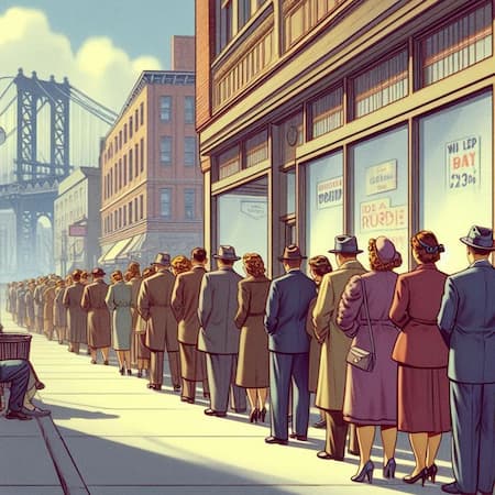
Above: Large Image: File Name: 800x800-optimized-hero.avif, 58k OR 800x800-optimized-hero.webp, 97k OR 800x800-optimized-hero.jpg, 105k | Small Image: File Name: 450x450-optimized-hero.jpg, kB OR 450x450-optimized-hero.jpg, k OR 450x450-optimized-hero.jpg, kB | File Dimensions: 800px x 800px OR 450px x 450px | Max Rendered Dimensions: 800px x 800px or 450px x 450px
Speed Testing Five Approaches
to Image Optimization
Approach 4
Picture Tag with SrcSet
For most use cases, the techniques on this page are widely recommended and should deliver excellent performance. While there are more advanced methods (like selective area and adaptive optimization), the Picture tag with SrcSet offers a high degree of flexibility for common scenarios.
These images were resized to their maximum rendered dimensions and compressed using Squoosh.app into AVIF, WEBP, and JPG formats.
Why Multiple Formats?
AVIF and WEBP offer higher compression rates while maintaining excellent image quality, compared to JPG. However, it's crucial to provide JPG as a fallback since some browsers still lack support for these newer, next-gen formats.
The Responsive Hero Image Using the Picture Tag
Similar to the previous test pages, the hero image on this page is responsive. However, this time we use the Picture tag with Source SrcSet attributes, allowing the browser to choose the best file format and size for the device:
- Large screens receive larger images
- Phones get smaller images
- Browsers supporting AVIF or WEBP can use those formats for faster loading, while JPG acts as a fallback for others.
Here's the HTML code for the hero image:
<picture>
  <!-- AVIF format (preferred format for modern browsers) -->
  <source srcset="450x450-hero.avif 450w, 800x800-hero.avif 800w"
          type="image/avif"
          sizes="(max-width: 800px) 100vw, 800px">

  <!-- WebP format (fallback for browsers that don't support AVIF) -->
  <source srcset="450x450-hero.webp 450w, 800x800-hero.webp 800w"
          type="image/webp"
          sizes="(max-width: 800px) 100vw, 800px">

  <!-- JPG fallback (recognized by all browsers) -->
  <source srcset="450x450-hero.jpg 450w, 800x800-hero.jpg 800w"
          type="image/jpeg"
          sizes="(max-width: 800px) 100vw, 800px">

  <img src="450x450-hero.jpg"
       alt="hero image"
       style="width:100%; max-width:800px; height:auto; aspect-ratio:1/1;">
</picture>
Advantages of Picture Tag with SrcSet
This method offers the smallest file sizes and fastest download and rendering times. In fact, this approach shaved over 4 seconds off the page load time compared to our non-optimized page!
General testing details
As with the previous pages, this page and its images are served from a non-secured server to avoid the speed improvements introduced by SSL and HTTP/2. Both Gzip compression and browser caching have been disabled via the .htaccess file. The varying text across pages introduces no significant differences (less than 2.5 kB), and the CSS remains the same across all tests with no scripts involved.
Gallery

275x275
AVIF: 18 kB
WEBP: 23 kB
JPG: 21 kB
File Dimensions: 275px x 275px
Max Rendered Dimensions: 275px x 275px
Image "lazy load": Yes

275x275
AVIF: 15 kB
WEBP: 19 kB
JPG: 19 kB
File Dimensions: 275px x 275px
Max Rendered Dimensions: 275px x 275px
Image "lazy load": Yes

275x275
AVIF: 18 kB
WEBP: 23 kB
JPG: 23 kB
File Dimensions: 275px x 275px
Max Rendered Dimensions: 275px x 275px
Image "lazy load": Yes